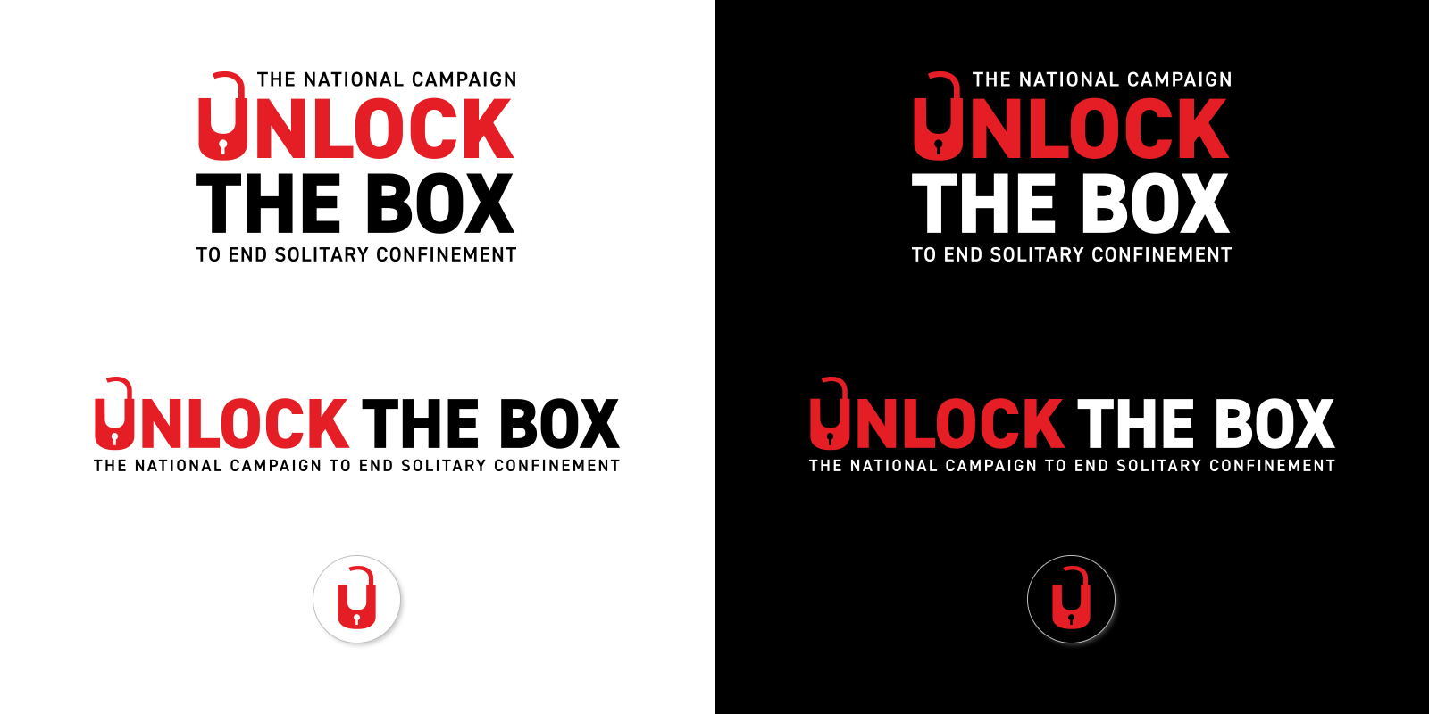
Unlock the Box is a national advocacy campaign aimed at ending solitary confinement in all prisons, jails, and detention facilities, and bringing the U.S. into full compliance with the United Nation Mandela Rules. I was contracted to update their logo and present options for a visual refresh of their website.
brand refresh - Unlock the Box

The new logo’s redrawn lock, blockier fonts, tighter spacing and dialed-up color contrast result in a more unified and impactful visual message. Readability at a glance is improved, and the overall effect is more professional and intentional.

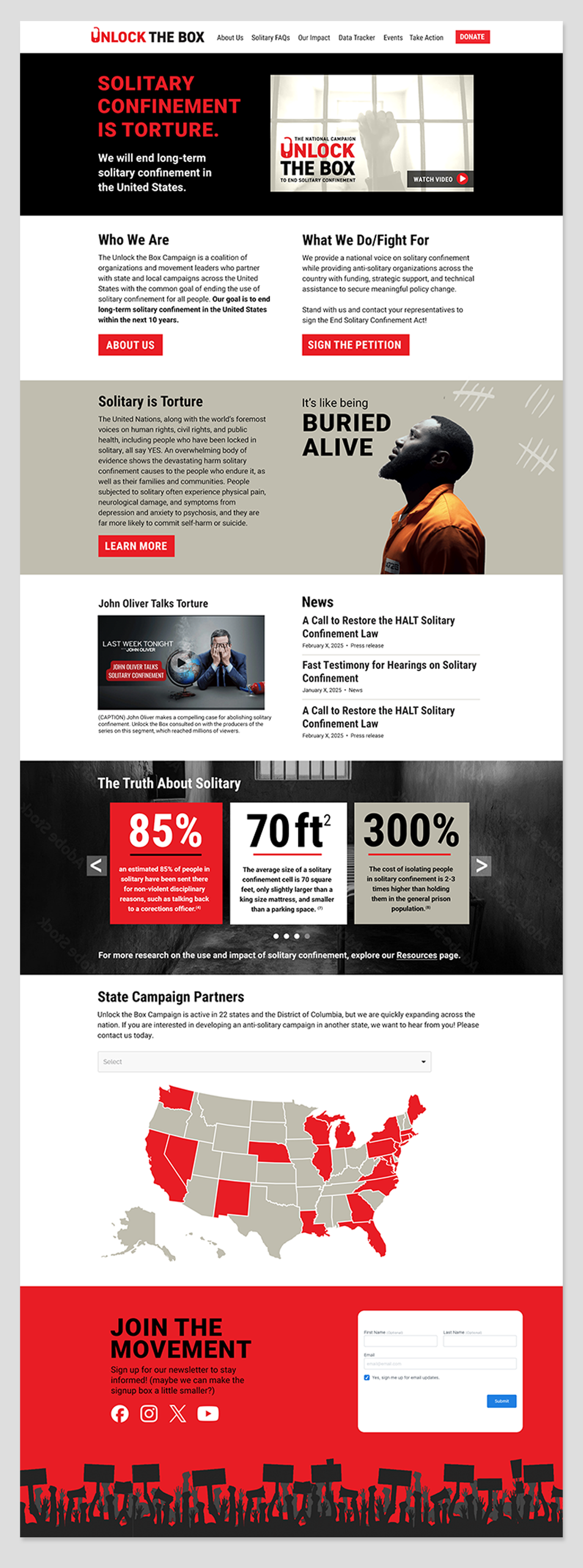
For the website, I did a high-level review and recommended several navigation and language changes, as well as trimming content to improve the user experience. Font-wise, my recommendations included creating obvious button styles, changing headers from all caps to title case, and employing a more readable font to clarify hierarchy. Other high-priority visual suggestions included moving the logo to the top navigation and brightening up some colors to allow more visual breathing room while adhering to the established black & white, heavy-looking theme appropriate to the serious subject matter.
Because we worked under a tightly restricted budget, we chose to prioritize a few of my recommended edits. We slightly edited the site navigation, and I worked up a visual UI refresh to include new treatments for in-site infographics and video thumbnails. The client requested simple static Photoshop mockups (as opposed to a working prototype) that they plan to implement from the existing Wordpress backend at a future date, as time and budget allows.

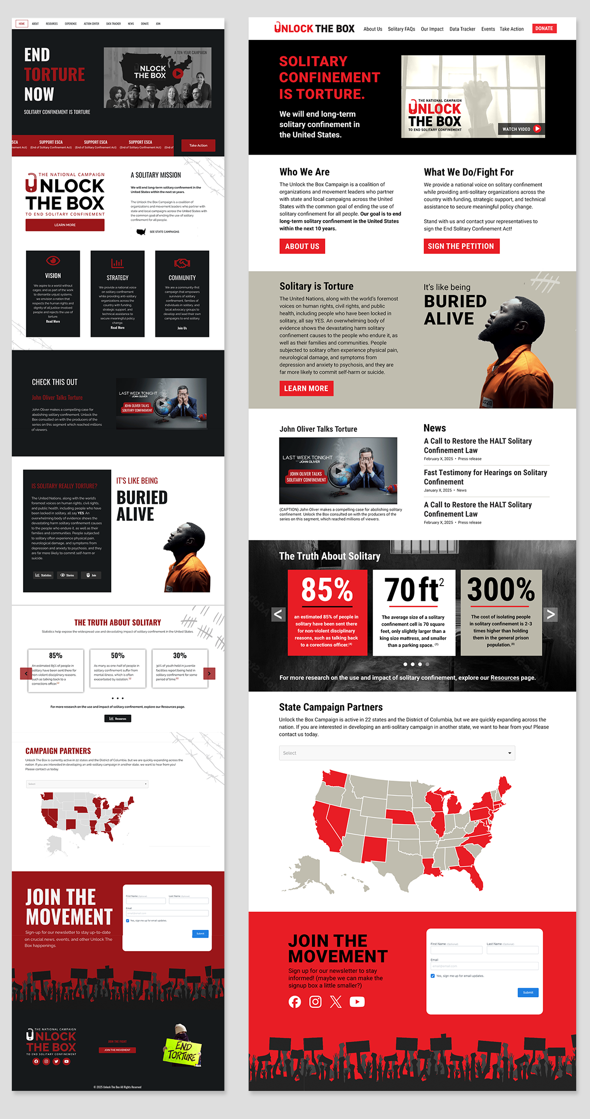
Below: side-by-side of existing site and proposed design refresh. The new home page still gives a snapshot of the entire site’s contents with previews of most of the other sections, but it’s more streamlined, better organized and easier to read and navigate.

