data visualization
Deep background of 15+ years' designing federal data reports for digital and print, and a wide variety of tailored infographics for news media. Experienced with data visualization platforms Infogram and Datawrapper. Infographic samples from AARP news articles are shown below.
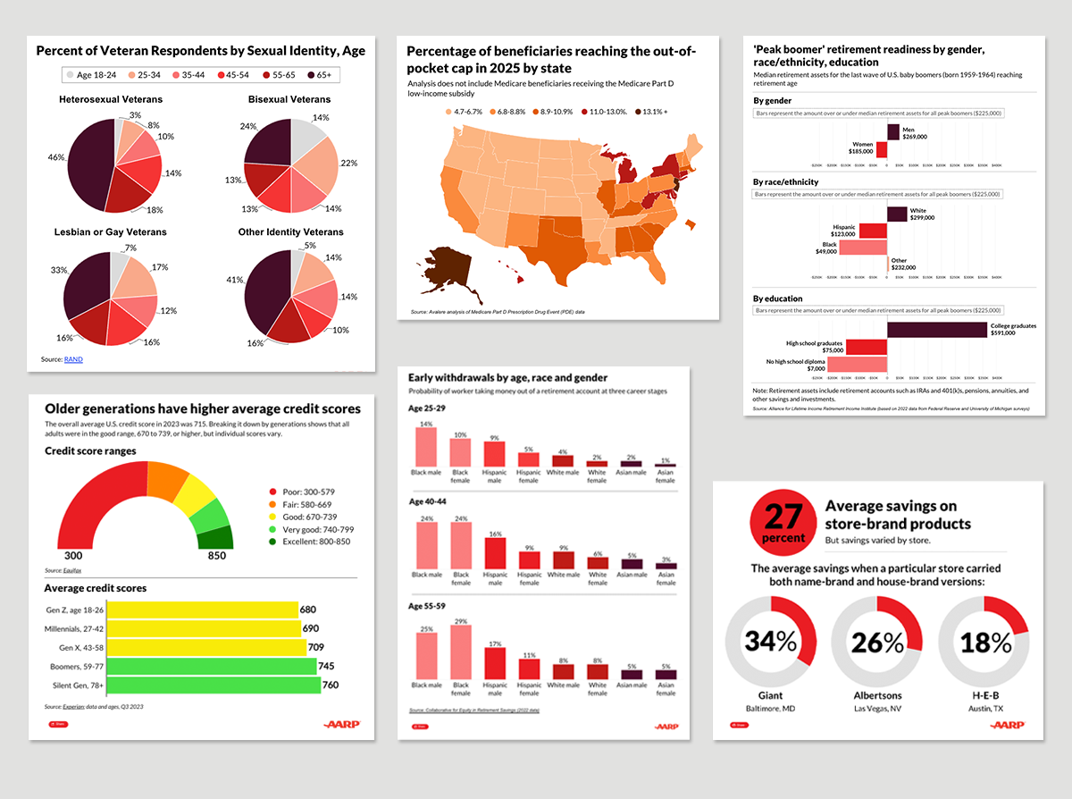
Static Infographics


Dynamic graphics, created with Infogram
In 2023, I led the effort to test and implement two interactive data visualization platforms for AARP.org, creating 100+ on-brand infographics within the first six months that garnered 2M+ monthly views and increased user time on page.
For the rollout, I created templates for maps and common bar charts with colors, fonts and styling aligned to AARP brand guidelines. I created SOPs and learning sessions to train other design and production staff and ensured they were readily available on our Sharepoint hub. A few samples/links below.